The Zoru brand, and how to use it.
Logos, colours, type and voice for partners, press and anyone building with Zoru, with the rules that keep them consistent.
The wordmark and the orbit.
The logo is the word zoru with a green orbit ring around the “o”: the “o” is the planet and the ring is the measurement around it. The ring is the only colour in the logo, and it stays exactly as supplied.
-
Primary
Navy with the green orbit
For white and light backgrounds.

-
Reversed
White with the green orbit
For dark backgrounds, and for photography only under a dark overlay.

-
App icon
The orbit “o” on its own
White on the navy gradient, in a rounded square: the favicon, the app icon and the byline picture on our blog. Below 24px, use the icon, never the wordmark.
 64px
32px
64px
32px
 16px
16px
Use the official files, every time.
Do
- Keep clear space of at least one “o” height on every side of the wordmark.
- Keep the wordmark at least 20px tall on screen and 25mm wide in print. Below that, use the app icon.
- Scale it from a corner, so it never stretches.
- Use the reversed logo on dark backgrounds, and on photography only under a dark overlay.
Don’t
- Recolour, remove or redraw the orbit ring.
- Place the logo on the green gradient, on mid greys, or on a photo without the dark overlay.
- Re-set “zoru” in another typeface, or add a tagline inside the clear space.
- Add shadows, outlines, glows, rotation or stretching.
In writing, the name is Zoru: capital Z, the rest lowercase. Lowercase “zoru” appears only in the wordmark and in the domain, zoru.earth.
Green on space, green on white.
One accent, the green pair, on two grounds: deep space for the story, white and off-white for the work. Everything else is a neutral or a status colour. Body text needs a contrast of 4.5:1, and large text and interface parts need 3:1.
Core
- Space
- #060A14
- Heroes, one dark band per page, closing calls to action and the footer.
- Space light
- #0C1224
- Raised elements on Space.
- Ink
- #181D25
- Text on green and lime buttons: 5.8:1 on green, 9.7:1 on lime.
- Grey 900
- #101828
- Headings and body text on light: 17.8:1 on white.
- White
- #FFFFFF
- Light surfaces, alternating section by section with Off-white.
- Off-white
- #F8F9FB
- Light surfaces, alternating section by section with White.
- Zoru Green
- #5DA92F
- The accent: gradients, fills, bars and focus rings. Never text on light: 2.9:1 on white.
- Lime
- #9BD46A
- The accent on dark: highlighted words, links and icons. 11.3:1 on Space.
Text and lines
- Grey 600
- #475467
- Body copy on light: 7.7:1 on white.
- Grey 500
- #667085
- Captions and muted text, 13px minimum: 5.0:1 on white, 4.7:1 on Off-white.
- Grey 400
- #98A2B3
- Body copy on dark: 7.7:1 on Space. Never on white, where it is 2.6:1.
- Grey 100
- #EAECF0
- Hairline rules on light surfaces: structure comes from lines, not boxes.
Status
- Success
- #2D8659
- Ticks, icons, large text and Scope 1. Exactly 4.5:1 on white, so icons and large text only.
- Success dark
- #236B47
- All small green text on light: links, eyebrows and labels. 6.4:1 on white.
- Complete
- #1E5E1E
- Text on the light green success tint.
- Next blue
- #2563EB
- Next-action dots in product visuals, and the focus ring on light surfaces.
- Warning
- #DAA520
- Held, in progress or needs attention. Never text: 2.2:1 on white.
- Warning ink
- #8B6508
- All warning text: 4.8:1 on its tint.
- Error
- #DC3545
- Borders and icons for errors. Error text uses a darker red.
- Info ink
- #1D4ED8
- Text on the light blue info tint, such as Compliance topic chips.
-
Scope colours
The three scopes, from your own fuel and vehicles (Scope 1) to the emissions in your supply chain (Scope 3), run dark to light, so they differ in lightness as well as hue. Keep this order, and always label scopes in text too.
Scope 1 · #2D8659Scope 2 · #5DA92FScope 3 · #9BD46A
-
Gradients
- Brand90°, Zoru Green to Lime. One highlight per page, in the main headline, plus thin bars and underlines.
- Button135°, Zoru Green to Lime, with Ink text. Primary buttons only.
- PanelsViolet (#1A0F40 to #2A1866) and navy (#0A2540 to #0D3460) for dark cards, green and cream for light ones. No new ones.
- AtmosphereCosmic violet #5433FF, cosmic blue #20BDFF and aqua #A5FECB, in background glows only. Never text, buttons or data.
IBM Plex Sans speaks, Inter explains.
Headings, numbers and product titles are IBM Plex Sans, tight and confident. Body text, labels and buttons are Inter, quiet and legible. Everything is in sentence case, and there is never a third family.
- Page headlineIBM Plex Sans 600 · 40 to 64px · −0.04em
The planet can’t wait. Neither should your data.
- Section headingIBM Plex Sans 600 · 32 to 48px · a statement, then a muted continuation
What makes it hard, and how Zoru fixes it.
- Sub-headingIBM Plex Sans 600 · 20 to 24px
Review and sign-off, built in
- BodyInter 400 · 16px · line height 1.65
Describe an activity in your own words, in English, French, German or Spanish. Zoru reads it, prices it with UK government (DESNZ) factors and holds anything unclear for review rather than guessing.
- EyebrowInter 600 · 12px · uppercase · +0.12em
Scope 1, 2 & 3
-
The logo font
The wordmark is set in Marble Bold and supplied as an image, so nobody needs the font to use the logo. Marble is for the wordmark only: headings, product names and partner names never use it.
-
Getting the fonts
IBM Plex Sans (500, 600 and 700) and Inter (400 to 600) are open source under the SIL Open Font Licence, and free to download.
Real forests, with the product on top.
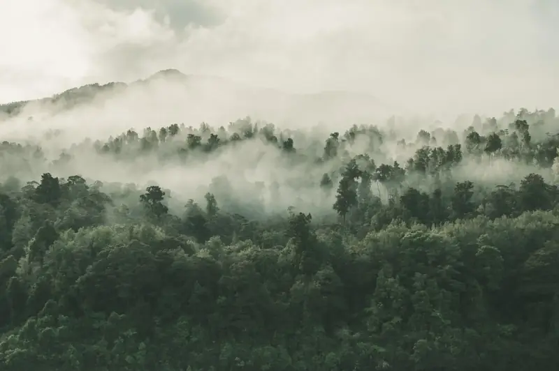
Photography grounds the product in the world it measures. We use forest, canopy and leaf images only, and a photo always carries a product card or a facts bar. It never appears on its own.
- Atmospheric landscapeAerial, misty and desaturated. Full width, under the dark overlay.
- Light through the canopySaturated greens and sun flare: the hopeful register for plans and targets.
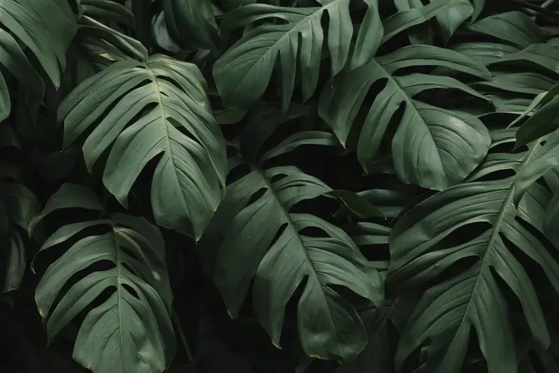
- Texture close-upDeep greens with strong shapes, behind a card or a figure, never the whole hero.
- NeverStock people, handshakes, wind turbines, globes in hands or smokestacks, and no AI-generated people, products or offices.
Clear, confident, practical and warm.
Zoru sounds like an expert colleague who makes carbon accounting feel doable. Lead with the outcome for the reader, then explain how, in short sentences and plain words.
- A promise
Just tell us. We’ll do the maths.
Short sentences, a promise and no adjectives.
- A feature
Lines Zoru isn’t sure about are held for review, not guessed.
A concrete feature with a concrete benefit.
- The positioning
Carbon accounting, from bills to a signed-off report.
What Zoru does, in one line.
-
Plain, direct, checkable
- British English, sentence case, and “you” for the reader.
- Explain a term the first time it appears: “Scope 3 (the emissions in your supply chain)”, “tCO₂e (tonnes of CO₂ equivalent)”.
- Every number has a source and a year. Name the factor set and its year, never “the latest factors”.
- Only claim what the product does today.
-
House style
- “Scope 1, 2 & 3” in headlines, “Scope 1, 2 and 3” in sentences.
- Buttons name the outcome, such as “Get started”.
- Plain words, no buzzwords, and no invented statistics, quotes or logos.
- Zoru is a trading name of NOISSIME LTD. The legal name appears only in legal copy.
Legal line for contracts, invoices and footers: © 2026 NOISSIME LTD (trading as Zoru) · Company no. 17160439 · 71-75 Shelton Street, Covent Garden, London WC2H 9JQ
Partner first, powered by Zoru.
When Zoru sits behind a partner’s work, the partner leads. Co-branded material reads “{Partner} – powered by Zoru”, with the partner’s logo in the primary slot and the Zoru wordmark smaller.
- The words“{Partner} – powered by Zoru”, with an en dash and a capital Z.
- The logosThe partner’s logo first. The Zoru wordmark after it, smaller, with its own clear space and at least 20px tall.
- ConsultanciesWhen a consultancy runs a client’s account, the client’s Carbon Reduction Plan carries the consultancy’s name, and its logo once Zoru has added it.
- CheckingWant a lockup checked before it goes out? Talk to us.
Using the Zoru brand? We can help.
Partners, press and consultancies: if you need the logo files or want a co-branded lockup checked, talk to us.